

Photo by Lautaro Andreani on Unsplash
Building Unique React Components Using Unstyled Component Libraries
This blog post will examine when using unstyled component libraries over other approaches to build unique components is likely to be the best choice.


Introduction
There are a few different approaches you can take when building a unique component or implementing a whole design system. When I say a unique component, I mean a component that needs to be unique in one or two of the following ways: 1) have a unique look and feel, and 2) have some unique behaviour/functionality. Additionally, we obviously want our components to look and behave correctly across different browsers, be accessible, etc. You can build components from scratch yourself (that's a bad idea, more on why that's the case later), use a fully styledUI component library like Material UI and customise their components to fit your requirements, or use an unstyled component library. There is also another category of libraries called composition primitives. These libraries are usually used when something that unstyled components do not allow to change needs to be customised. I'll cover each of these options in this blog post. As with everything in engineering, the choice is all about evaluating trade-offs and picking the best approach for your situation.
Why Not Build It Yourself?
Let's say your designers want you to build a dropdown menu component that has some unique look and behaviour. Why should you not just build it yourself? That doesn't sound too complicated, but actually doing it well is far more time-consuming than most developers think. In this great talk, one of the authors of Radix UI (an unstyled component library) mentions that it took them over 2000 hours of development time (!) to build an unstyled, customisable, accessible dropdown menu component. So, when it comes to building complex components that are needed in almost all modern web apps, such as accordions, autocompletes, dropdown menus, and dialogs, the cost of doing it well yourself by today's standards is prohibitively high. That's because you need to worry about things like browser and screen reader support, focus management, keyboard navigation, accessibility attributes, and valid markup. Getting it right will require a lot of research, building, and testing to, for example, detect bugs that only occur in specific browsers. The quality standard for UI components is now higher than ever, and products need to be accessible for companies to stay compliant and avoid being fined.
That's where unstyled component libraries come in – they provide you with a set of components that take care of the functionality and accessibility and leave the styling up to you. They work with any styling solution – CSS-in-JS, Tailwind CSS, vanilla CSS, etc. The main advantage of using them over a library of fully styled components, such as Material UI, is that you can customise them to fit your unique requirements (look + behaviour) much more easily than when you start with a fully styled component and try to make it work the way you need it to work for your use case. Styled component libraries are also coupled to a specific styling solution. An unstyled component will, however, take care of rendering valid markup. There are a few lower-level libraries that allow developers to customise the DOM structure, but I'll cover that later in this blog post (in Composition Primitives).
Okay, so are there cases when building a component from scratch yourself makes sense? I've just talked about why it's a bad idea if you need to implement a complex component, but what if you just need to build a very simple component, such as a button? That should be easy, right? It turns out that even doing that well takes a lot of time for the same reasons why building more complex components is hard. One of the members of the team behind React Aria Components examines why even building buttons takes a lot of work in great detail in 3 separate blog posts that you can find here.
To conclude, I think it's hard to come up with any arguments in favour of building components from scratch yourself when you can take an unstyled, accessible component from an unstyled component library and easily customise it. It's just very easy to overlook some small things. For example, if you use a div instead of a button element to create a button, you must add certain attributes to the div for a screen reader to understand that it's a button.
When Should You Use a Fully Styled Component Library?
There are a lot of very well-known libraries with large communities to choose from in this category. Some of the most popular ones are MUI, Chakra UI, NextUI, and Mantine. I will not compare them here and instead will spend a bit of time discussing when you might want to use a fully styled component library at all.
The main downside of using fully styled components is that the more unique your requirements are, the harder it becomes to customise the components to fulfil them. For example, MUI provides a number of ways to perform a deeper customisation of their components, but if you really try to get their component to look or behave in a way that's quite different to what you get out of the box, you'll quickly find yourself spending a lot of time figuring out exactly how to do it, and almost certainly end up with dirty, hard-to-understand code. Moreover, even if you fulfil today's requirements using fully styled components, if they change sufficiently in the future, you may not be able to customise the components as needed anymore. The advantage of using fully styled components is that your development velocity should be higher compared to other solutions if little customisation is required. You just take a component, pass it some props, and you're done. However, it usually doesn't take that much longer to implement the same component using an unstyled component as a starting point. Therefore, I think there are only a few cases where using fully styled components might be the best choice.
The 3 cases when I think using fully styled components might well be the best option are:
Prototyping
Building MVPs
Building internal tools
This list is obviously non-exhaustive, but I think in each case you probably don't care as much about that unique look and feel that's so important for more mature customer-facing products. If you don't need any particularly unique behaviour, going with styled components might well prove to be the optimal choice.
Overall, I think you need to carefully consider how well you can meet your application's requirements using styled components before choosing this option. Also, don't forget to consider that you might have to pay for the quicker initial development velocity with a lot more work later on to meet changing requirements.
When and How to Use Unstyled Components?
This is the most common approach to implement design systems in 2024. Assuming you've decided that this is the right approach for your situation, there are a few more things you need to know.
The first question is – what are some of the most popular libraries to choose from? Some of the ones to have a look at are:
Those are all unstyled component libraries. Just to recap – they provide you with valid markup, functionality, and accessibility, but leave styling up to you. For an example of what unstyled components look like, check out the Dropdown Menu component by Radix UI. Notice how much you get out of the box here with fairly little code – things like keyboard navigation, focus management, typeahead support, etc. Even collision-aware positioning is taken care of, as you can see below.
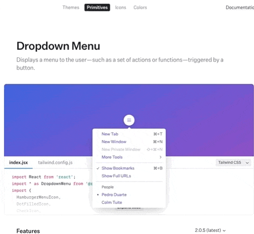
As I resize the browser window and there's not enough space left for the menu, it repositions itself. Pretty cool, huh?
Composition Primitives
Unstyled components work really well most of the time, but sometimes you might need to customise things even further. For example, you may need to customise the DOM structure. There's another category of libraries that provide composable primitives to create accessible components. They don't implement any rendering or styling. Instead, they only provide behaviour, accessibility, and interactions. Some of the ones to have a look at are:
I'd also like to share this repo that contains a more exhaustive list of component libraries of both types (unstyled components and composition primitives) as well as single-component projects.
For a more comprehensive discussion of when you should use these lower-level primitives instead of unstyled components, I highly recommend reading this part of React Aria's docs. The rule of thumb is to only drop down to lower-level APIs when you need to customise something that unstyled components do not allow you to. They can also be used together with unstyled components to achieve the needed level of customisation. It does take more code to achieve the same thing using these primitives than using unstyled components. To get a feel for how much more code you need to write, you can have a look at this CodeSandbox. It just shows an example of a dropdown menu component built with React Aria Hooks, and it's informative to compare the amount of code needed to build it with the amount of code needed to build a Dropdown Menu using an unstyled component from Radix UI.
Conclusion
Building high-quality, accessible components that meet the needs of modern web applications is a surprisingly challenging task. Choosing the right approach to building your components is critical to ensure optimal developer experience and development velocity. Whether or not you will be able to change your code quickly as requirements change also depends on the approach you pick, so pick carefully. ;)